Sometimes a step back is a giant leap into the future
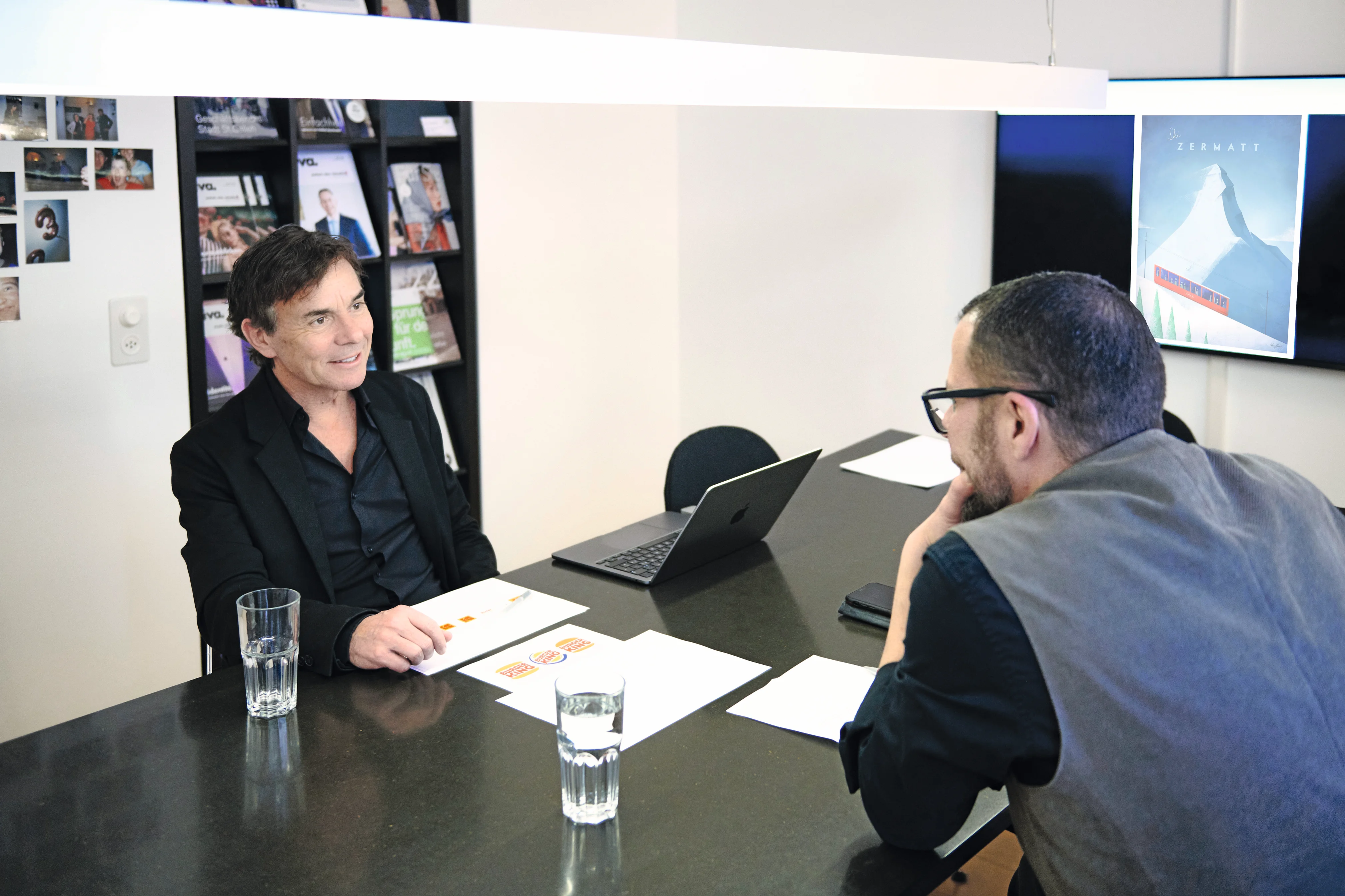
Beat Lüscher is the owner of the design agency ‘Die Gestalter’ and a lecturer at the School of Design in St.Gallen. The vintage style plays an important role in both areas of activity. And actually for a very simple reason.
Beat Lüscher, the terms ‘vintage’ and ‘retro’ basically mean the same thing, don't they?
Beat Lüscher: Yes, you can see it that way.
They're about the past. Why is it still relevant in marketing today?
That's relatively easy to explain. Let's take the advertising for the ‘Zermatt’ tourist region as an example. This is pure retro. It evokes positive memories of the past without being nostalgic. We are sold a beautiful, intact world in which there is no mass tourism. Retro has a lot to do with values. And that brings us right back to branding.
And how? In what way?
The history of the ‘Pepsi’ logo is a wonderful illustration of how a brand moves away from its own values and then eventually finds its way back to them. The first lettering in 1905 was deliberately modelled on that of ‘Coca-Cola’. The differences were just big enough to avoid the risk of a lawsuit - at least in those days. After around 50 years, the company broke away completely and came up with a logo and a colour language that is completely incomprehensible from today's perspective. Today ‘Pepsi’ is now very close to its former core, radiating confidence and evoking memories of childhood. And we are not talking about our grandparents. Rather, the feelings of being grounded are aimed at the younger generation.
It is noticeable that America in particular is focussing heavily on the retro style. What is that connected to?
Many brands from America experienced their ‘triumphant advance’ after the Second World War, when US soldiers were stationed practically all over the world and thus became quasi ‘brand ambassadors’ for ‘Pepsi’, ‘Kodak’ and so on. Such products very quickly became very well known.
‘Kodak’ is currently experiencing a resurgence.
Yes, and that's after the brand almost completely disappeared in 2016. You can also see this in the logo at the time - a kind of desperate act, a last gasp - with which they completely separated themselves from the old. Now they are practically orientating themselves back to the original one-to-one.
You teach young graphic designers. How receptive are they to the ‘old forms’?
They find the stories exciting. But they would rather develop something completely new than build on the old. Personally, I find re-designs extremely exciting and challenging. You have to think about how to keep the good part of the DNA and which elements to get rid of.
So the marketing industry is very much orientated towards what was created decades ago. Did they get so much right back then?
You can't say that in general. People certainly didn't take such a radical approach in the past as they do today. We took things step by step and then analysed whether it was the right decision. Today, we also have a faster pace of management change - and this very often has a direct impact on the company's image: a new CEO wants to signal that a new person is at the helm. And it is not uncommon for him to do this externally with a new branding.
Is it possible to say in general terms at what intervals the branding should be adapted?
I would do it like ‘Nike’ and work continuously on the brand. That makes sense. After all, consumers don't appreciate big leaps. Take the Burger King logo as an extreme example. The company started out with an extremely reduced realisation. Halfway through the company's history, there was a complete change: with glossy effects, a blue colour and other elements that nobody understands. The result does not correspond to a provider that one would associate with enjoyable food. The company has now returned to the original design - which is almost identical to the initial logo.
As a designer, would you dare to present such a proposal? It would immediately mean that nothing had been done except to transform the old one a little ...
And that's exactly what retro is (laughs). But you know, behind ‘Burger King’ is one of the biggest branding agencies in the world. As a customer, you have a certain basic trust. And they explain to you on 47 presentation pages why it has to be back to the roots and nothing else. And it works for Burger King. The logo gives you the feeling that the buns are freshly prepared in the in-house bakery. Sometimes a step back is a big step into the future.
And we all know that the bakery thing isn't true. So if I start a new company, is it best to equip it with a retro logo that gives the impression that the company has been around for over 100 years?
Of course. That's the trick. I noticed a newly founded bakery chain in Barcelona. When you look at the logo, you get the feeling that it has been producing for 120 years.
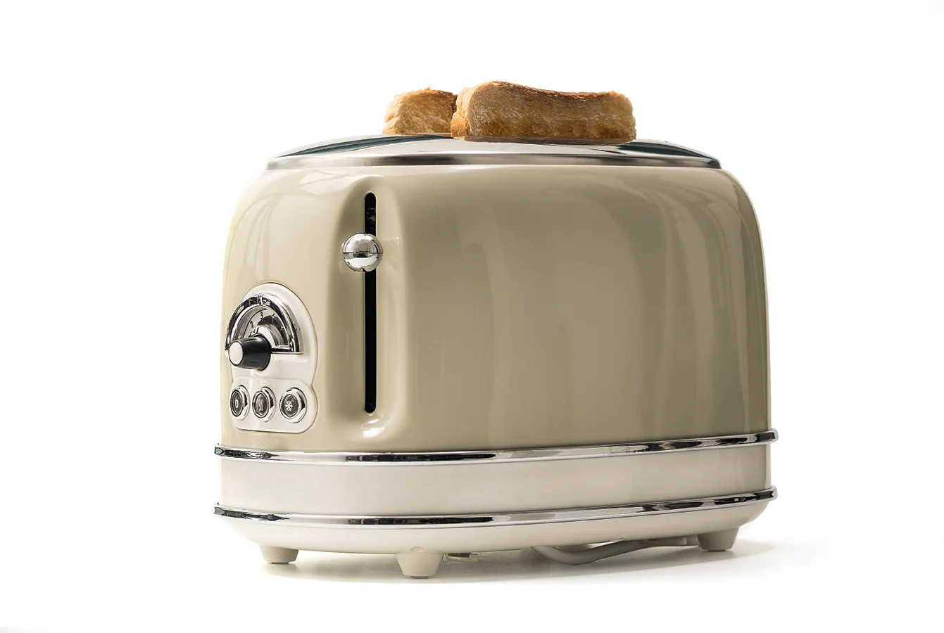
It makes sense here. But why are we finding favour again with old designs for telephones, hairdryers and toasters? Is this also about awakening old feelings?
This is certainly a goal for the older generation. But you also want to appeal to the younger generation. And they like products from a ‘different world’. The toaster is a good example: Who wants to have to look at a dreary, angular design on a Sunday morning? The completely overpriced, shiny red toaster with its organic shape and beautiful fire is much nicer. In the 1950s and 1960s, a lot of fun designs were created. This was later followed by reduction and the disappearance of opulence.